
Choosing brand colors for a B2B company comes down to four steps: 1. Read the color conventions in your category 2. Decide whether to join them or break from them 3. Choose a color territory you can own and scale 4. Build a system that holds across every application Most guidance on this topic starts with color psychology and what individual colors mean - but our view is that your color choice should be a strategy for competitive distinction. Especially in B2B, where everyone is aiming to create the same feelings and thus opting for the same palettes, color is one of the most powerful - and underutilized - tools for creating a strong brand platform. This guide will walk you through how you can create a color strategy that is both resonant with customers and distinct in your market landscape.
Especially in saturated B2B environments, competitive distinction should be the top guiding priority for brand color selection.
Color is one of the most underutilized visual strategies for building a B2B brand that captures attention and ensures memorability. Though it can be logical and safe to choose your category's most typical color (blue in financial services, purple in tech), it can cost you the attention and recall that make visual identity worth investing in.
A palette should be an intentional system rather than a set of saved hex codes. One primary that carries the identity, a full neutral range, and one or two accents used sparingly.
Test the palette in real applications before you commit. A color that fails a contrast check or is hard to use in design will challenge the integrity of your design system.
Colors become brand assets through consistent repetition across every touchpoint.
Why color distinction should come before color psychology in B2B
Most brand color advice instructs you to start with the aspired feeling you want your brand to inspire in people. Such guidance will tell you that you should choose a color with meaning. (e.g., blue signals trust, green signals growth, and purple signals innovation).
While it's logical to account for color psychology in your branding, this can become problematic when you and your entire competitive set are striving to convey the same meaning and feeling. If blue means trust and you are the fortieth blue firm in financial services, your usage of blue buys you category membership. And category membership has little to do with whether customers pay attention or remember you.
Color is one of the most underused levers in B2B brand. This leaves significant opportunity for a firm willing to take creative risks.
What Lemonade understood
Insurance is a category built on institutional signaling. The established brands lean into restrained corporate palettes to communicate permanence to a buyer.
Lemonade entered that category and chose a saturated pink instead.
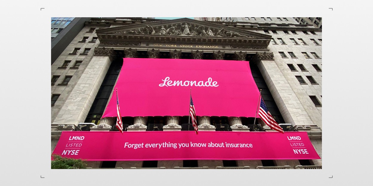
In addition to their strong choice of an arbitrary name, Lemonade’s palette communicates everything you need to know about their intent to disrupt their industry, in a second’s glimpse.
A vibrant pink in a sea of blue sameness carries the brand in a way that headlines and messaging simply can’t. More than any other aspect of their brand, their palette communicates who they are and what they’re about - and in a way no incumbent can copy. The pink is unmistakably theirs now; no one else in the category can use it.
That is what color is capable of when it’s treated strategically.
How to get started with your B2B color strategy
The first step to creating your B2B color strategy is getting clear on the color trends dominating your market landscape.
To do this, pull up fifteen to twenty competitors, direct and adjacent. Screenshot each homepage, drop them into a grid (you can use Claude Design if you don't want to mess with a design tool), and see if you can identify patterns in dominating colors, hue ranges (e.g., navy to cyan), and whether anyone's chosen a color that truly stands out.
Most B2B categories return the same answer. Financial services runs blue. Enterprise technology runs blue. Professional services runs blue and grey. Healthcare runs blue with occasional green. Industrial and manufacturing spread wider across red, orange, and yellow, though much of the sector still defaults to corporate blue.
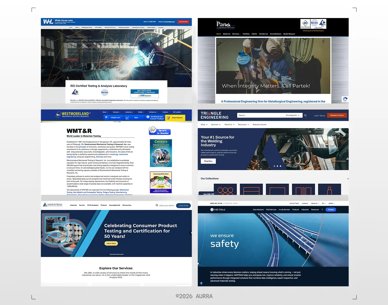
A recent color audit we conducted for a steel testing client shows that navy blue is the default color choice across the industry.
Once you've completed this quick analysis, you should have a strong sense for what your category-typical colors are. Now comes the fun part: deciding how far you want to stray from the norm.
The seven B2B brand color territories
After completing your first step of market research, you can then begin to consider the different colors and their associated meanings. Each color territory carries a distinct advantage, a distinct cost, and a set of conditions where it makes sense.
Blue
Blue is the incumbent position across most of B2B. Think IBM, Salesforce, Cisco, Lockheed Martin, Boeing, GE, General Dynamics, Goldman Sachs, Pfizer, and a substantial number of other enterprise software and financial services companies.
Why blue gets used: Blue reads as stable, competent, and institutional. In a category where the buyer needs reassurance before they will engage, it’s a natural choice.
What it costs: Memorability. Blue is so widely held that it’s hard to be recognizable for it.
Blue also has more range than most firms use. Navy carries institutional weight and reads as established. Electric and cyan blues read as digital and current.
Choose blue when your primary risk is looking unserious, and when you have another visual asset (logo; typography choice) that buyers can easily recognize and associate you with.
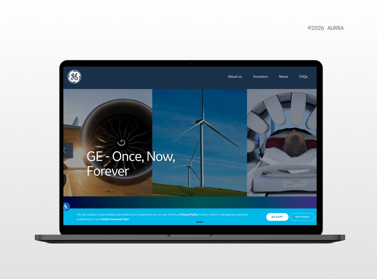
Given the complexity and range of GE's business, blue is a fantastic choice for its extendability.
Black, white, and monochrome
Monochrome removes color from the equation and lets everything else carry the identity. Think OpenAI, Palantir, Anduril, and much of high-end professional services.
Why monochrome gets used: A monochrome system reads as premium and design-aware, and it functions as a neutral stage, bringing elements like product screenshots and photography into focus. We actually chose a monochrome palette at Aurra as we want our visuals to center our client work more than anything else.
When we kicked off our brand and website refresh for Cloudworkz, an AWS engineering firm partner looking to upgrade their visuals in preparation for more enterprise-grade implementation work, the team told us that they identify as a “technology company, not a marketing company.” To convey their brand essence of engineering precision, rigor, and performance, we opted for a monochrome color palette. This kept the brand platform focused on the tangible business impact and outcomes they enable for their clients, instead of aesthetics and polish.
What it costs: Warmth. Monochrome carries none on its own, and it no longer reads as unusual. It also demands more from typography and layout than any other territory.
Choose monochrome when you want the focus to be on your work, and when your other visual elements are strong enough to hold the identity without support.
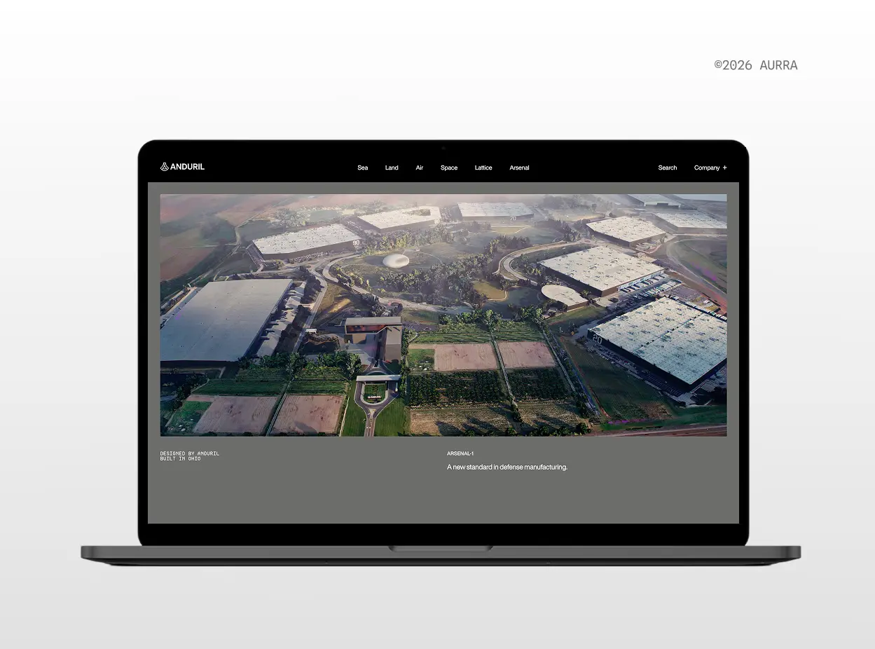
Anduril's absence of color is hardly noticeable with their photography-heavy brand universe. The company positions itself as doing some of the most important work in the world, and a no-nonsense visual identity backs that assertion.
Green & teal
Green and teal carry strong associations with growth, sustainability, and the natural world. Think John Deere, Deloitte, Cargill, Siemens, and much of energy and agriculture.
Why green gets used: Green is relatively under-occupied in most B2B categories outside its obvious homes. For example, in industrial or consulting spaces, a green-branded firm can stand apart while still reading as serious. Siemens' use of teal green has served the brand quite well.
What it costs: Green's association travels with it. A buyer might look for an environmental or agricultural story, and if there is not one, your messaging will need to provide that clarity.
Choose green or teal when you're far enough from the typical categories that the association reads as distinction rather than normalcy.
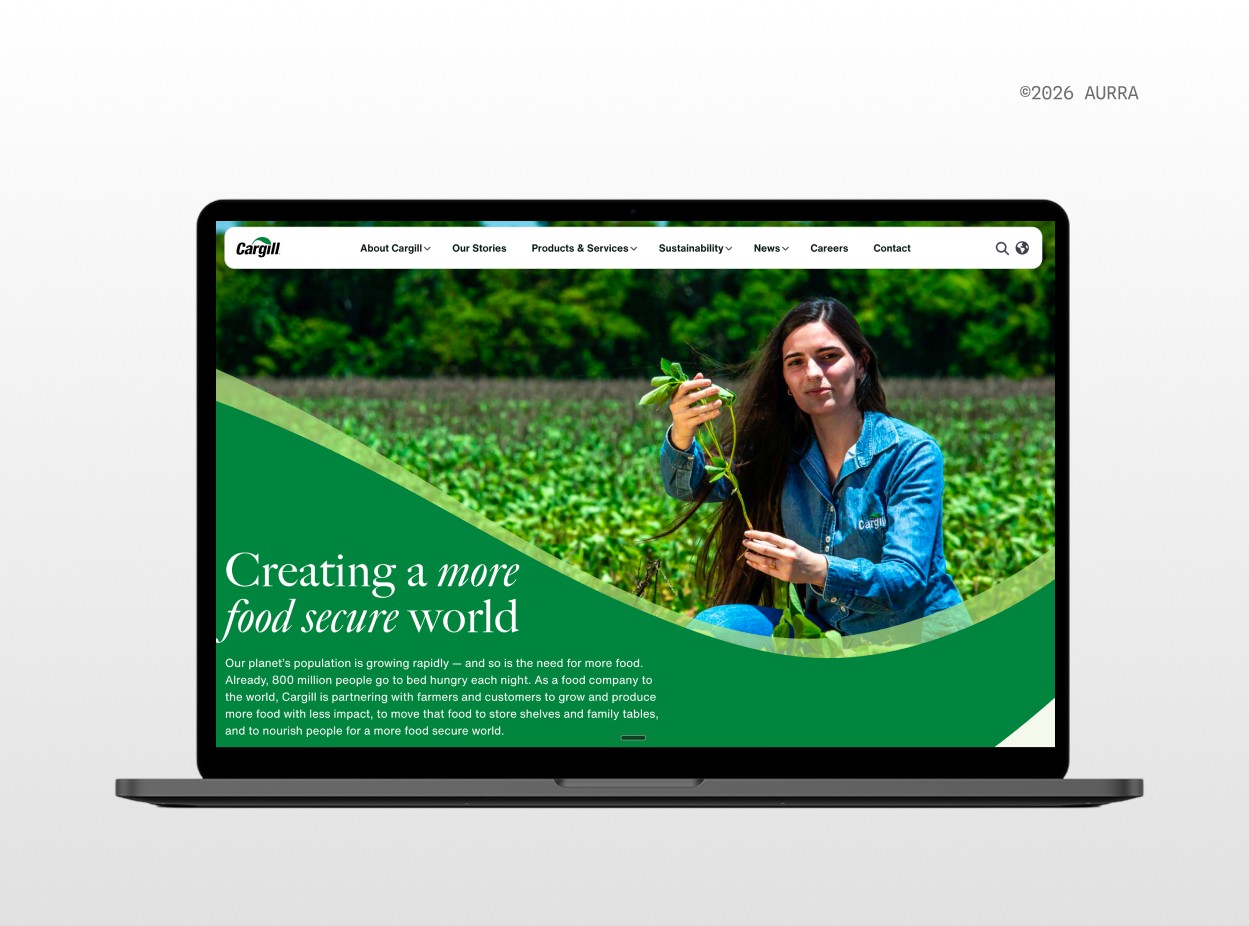
Cargill's green is expected and safe.
Purple
Purple can signal a position outside the category default and reads as forward-looking. Think Twitch, Slack, Nubank, and a rising share of AI companies.
Why purple gets used: Purple can be a rich foundation to build a design system around. This color choice also affords a good deal of range: deep purples carry authority, where lighter hues can read as modern and open.
What it costs: Distinction. The "AI purple problem" speaks to the LLM-driven proliferation of brands using purple, which has diluted its potential for impact.
Choose purple when you are claiming a leadership position in a category that has not yet consolidated. Pair it with disciplined neutrals so it reads as considered.

Slack's become so associated with their dark purple that I anticipate a loud market response when they rebrand.
Orange
Orange brings approachability into categories that tend toward the functional and impersonal. Think brands like Firefox, Cloudflare, HubSpot, and Bit.ly.
Why orange gets used: Orange brings warmth without risking seriousness. In professional services, industrial, or enterprise software, an orange-branded firm could read as more accessible or easier to work with.
What it costs: Orange can signal value and affordability, particularly at high saturation. It also conflicts with photography more than most other color territories, so it needs a considered relationship with imagery.
Choose orange when your category is cold and your differentiation is that you are easier to deal with.
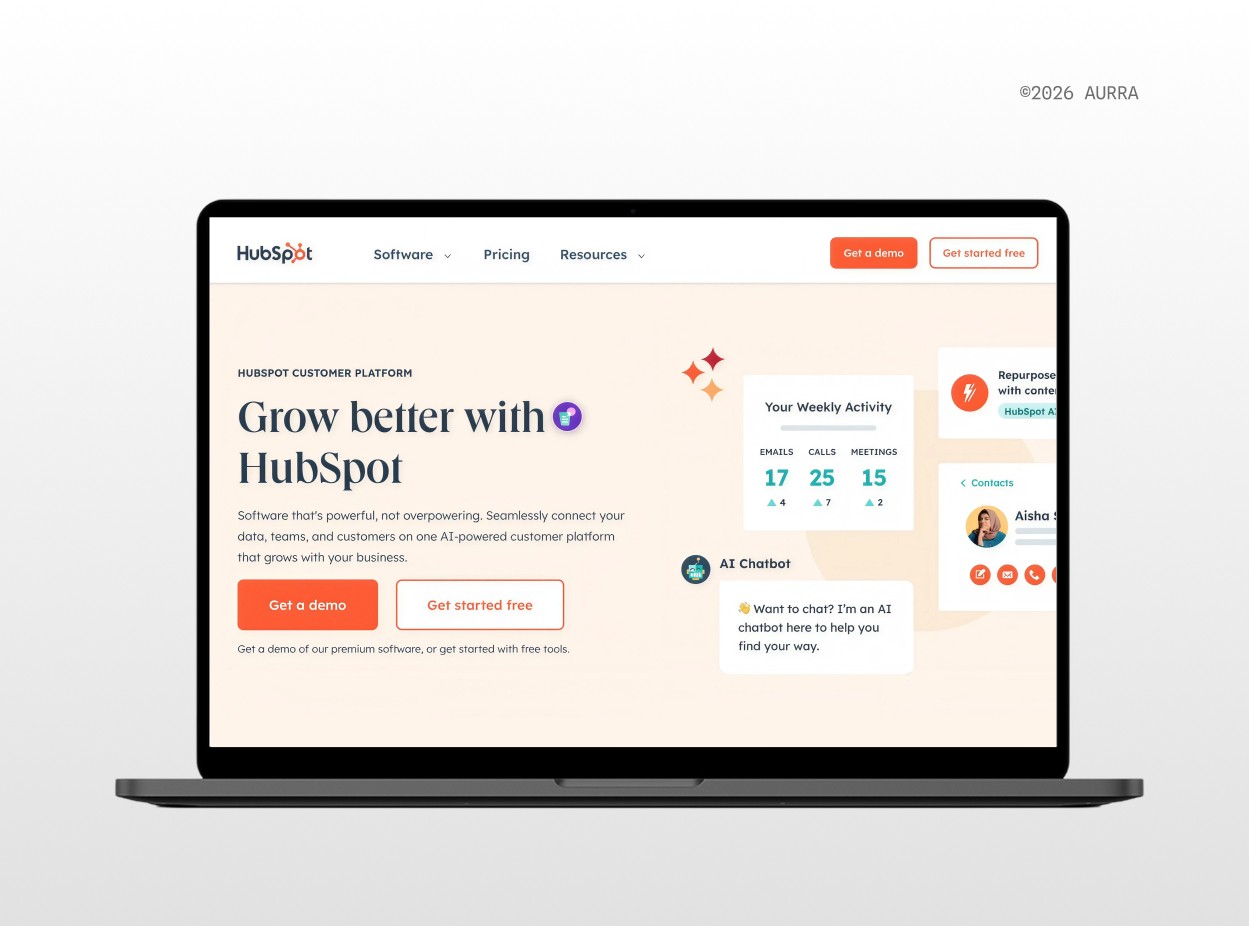
Hubspot is deliberate in how they balance their vibrant orange with a heavy dose of neutral.
Red
Red reads as decisive, confident, and hard to ignore. Think Cummins, Bosch, XPO Logistics, 3M, and a large swath of industrial manufacturing brands.
Why red gets used: Red claims attention faster than any other color territory. It can signal conviction, which suits firms whose positioning rests on concepts like performance or established authority in demanding fields.
What it costs: Red is loud, which can make it difficult for scale. It also carries functional meanings in interfaces and on equipment, where it signals error, stop, or danger, which could constrain how you can use it in product contexts, depending on your industry.
Choose red when your category rewards decisiveness. Just ensure that you plan the neutral system carefully to ensure balance and scale.
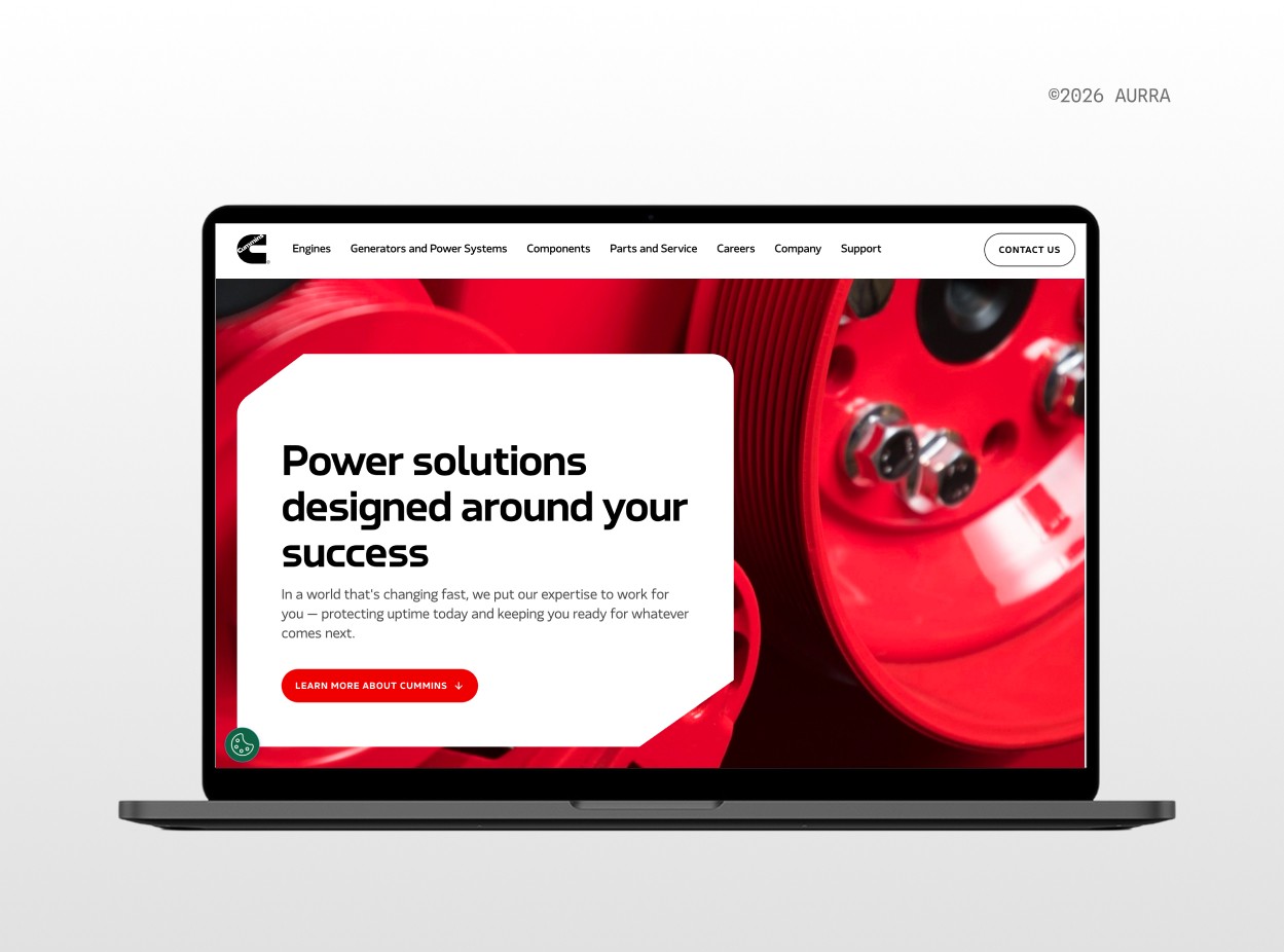
Cummins conveys performance and power in their signature red.
Yellow
Yellow is the highest-commitment territory in B2B - and it can be exceptionally differentiating when executed well. Think Caterpillar, and a small number of firms who use it as a full identity rather than an accent.
Why yellow gets used: Yellow as a primary brand color is rare in B2B, which means that choosing it can be a fast pathway to category recognition.
What it costs: Yellow is difficult to make legible, fails contrast requirements against white in most of its range, and needs a strong dark partner to function at all. Used tentatively as a small accent, it delivers none of the distinctiveness and all of the difficulty.
Choose yellow when you can commit to it fully, and only after you have tested it against your actual applications.
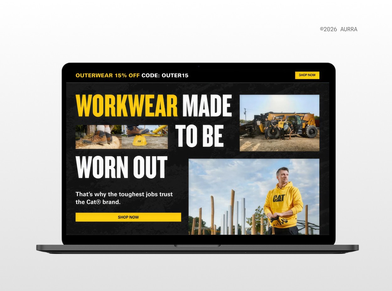
Yellow is a rare choice that requires restraint. Caterpillar's use of black to balance their yellow is best-in-class.
Summary: The seven B2B color territories
Reference this table for a quick comparison of what each territory buys you and what it asks in return.
Territory | Benefits | Choose it when |
|---|---|---|
Blue | Association with credibility; trust | Your priority is being seen as serious; distinction is not as important to you |
Monochrome | A neutral backdrop that centers on your work | You want to center your products/services, work, or impact |
Green | Distinction, depending on the industry | You want the established feel of blue but you want to stand out |
Purple | A versatile foundation and modern associations | You want to convey that you’re forward-looking & modern; distinction is not as important to you |
Orange | Conveying human warmth, ease, and consumer-centricity | Your category is otherwise cold & technical; you want to stand out and be approachable |
Red | The ability to easily capture attention | Your category rewards decisiveness; you are willing to weave in other colors to achieve balance |
Yellow | The strongest ownership available in B2B | You’re ready to commit and are confident you can balance it in real applications (testing recommended) |
Guardrails worth noting when choosing a B2B brand color
In some categories, color carries a meaning outside of your control, and choosing against it can create friction:
Regulated color meanings for manufacturing, industrial, logistics, and construction companies: Safety color conventions mean that red, yellow, orange, and green carry specific regulated meanings on equipment, signage, and personal protective equipment. It’s recommended to opt for a palette that considers these constraints if you operate within these contexts.
Interface and accessibility standards for tech companies: Applicable for any firm whose brand travels to a product screen, WCAG sets contrast minimums that a brand color either clears or does not. In interfaces, red indicates errors and destructive actions, amber indicates warnings and green indicates success. If a brand color conflicts with these existing associations or fails contrast, it risks getting swapped with a new variant inside the product. This is how a company can end up with two dominant blue shades with no clear answer about which one is the true one.
None of these parameters necessarily have to rule out a color territory - but they do mean the color choice should be deliberate.
How to ensure a high quality brand color palette
A B2B brand color palette is a system - not a set of saved hex codes.
Give it structure. One primary color that carries the identity. One or two accents used sparingly. A full neutral range, since neutrals do most of the visible work in any real application. Semantic colors for success, warning, error, and information, should be kept separate from the brand palette so a red primary color never gets mistaken for an error state.
Set proportions. Neutrals carry the foundation, the brand color anchors, and accents appear where you want to direct the eye. Avoid creating a palette where everything competes.
You will run into named “best practice” ratios for this, most often 60/30/10 and sometimes 70/20/10. Both concepts describe the same underlying idea: one color dominates, a second supports, and a third appears rarely enough to register. Treat these rules as a way to check whether your palette has a clear hierarchy, rather than as a specification to perfect.
Separate brand color from interface color. Your identity color and your product's functional color system do different jobs. A bold brand color does not need to appear on every interface element - don’t force it.
Treat contrast as part of the decision. Checking contrast early ensures your color passes legibility requirements.
Test before you commit. A brand color palette that works on a mood board can still fail in use. Before you finalize, ensure you’re placing the color in contexts it will actually live. Build a website hero section, presentation slide, or infographic using your selected colors. (Try using tools like Realtime Colors to rapidly iterate different options). Place your logo beside whatever badges and accreditation marks you carry. Render it small, in a LinkedIn avatar and a favicon, where most first impressions actually happen. Put it on print collateral as well. Then, set your colored visuals next to your competitors in a grid, similar to how you analyzed your color landscape at the start. Evaluate whether the palette's distinguished from your peers - and finalize accordingly.
Recommended tools to help you choose a brand color
If you’re taking a DIY approach to formulating your color strategy, there are a number of tools that can aid you in your process. Our team at Aurra uses the following toolbox when we’re developing brand palettes for clients:
Color tools for exploring your color territory & building your brand system:
Mobbin is a great tool for collecting design inspiration from trending websites and apps. This is a great place to start if you want to ensure you're building a modern visual identity.
Designmd sh is has a great library of design md files for popular websites and apps.
Eye Dropper is a Chrome extension that can aid you when analyzing your category landscape. It pulls the real hex values from your competitors’ websites.
Coolors generates palettes and allows you to lock a color you like while it suggests options around it.
Canva's Color Wheel covers complementary, analogous, and monochromatic relationships. Adobe Color does the same.
Khroma trains on fifty colors you select and then generates combinations from your own taste.
Colormind extracts palettes from an image. Worth using when your color needs to be congruent with existing photography or a physical product.
Color Hunt is a great tool to browse as a starting point for palette inspiration. Many of its palettes carry no strong contrasting color, so treat what you find there as a direction rather than as a system.
Color Hex shows tints and shades of any starting color. This is a great tool for solidifying your neutral range.
Color tools that can elevate the testing and validation of your palette choice:
WebAIM's contrast checker and Coolors' contrast checker both test legibility against accessibility standards. WebAIM is the reference most accessibility work cites.
Coblis simulates how your palette reads to someone with color vision deficiency. Especially in B2B, where your buying committee will be evaluating your collateral granularly - at the level of data, charts, and dashboards - this tool is one of the most valuable of the set.
When to choose your brand colors yourself, and when to get help
Plenty of leaders can run this process alone and land on a workable color palette, particularly if the business is early on, the category is uncrowded, or if the visual identity is something you are comfortable with revisiting later.
However, if your category is saturated, you’re aiming for a move upmarket, or you’re rebranding and shifting away from an identity that you’ve already built brand equity with, partnering with a visual design expert is likely worth the investment.
In those situations, a partner can help you see past your own internal bias to create cohesive and distinctive color territories that scale for the long-term.
Frequently asked questions about B2B brand colors
How many colors should a B2B brand palette have?
One primary color, one or two accents, and a full neutral range covers most B2B firms. The end number and proportion here matters less than your discipline. We only tend to recommend more robust palettes for firms with established governance workflows. Larger palettes tend to work only when the rules for using it are clear and the proportions hold.
Why is blue used in branding?
Blue reads as stable, competent, and institutional, which makes it a safe answer for firms selling to cautious buyers. Current state in B2B branding, blue now signals a company’s category membership more than it signals anything about their identity.
Which color is best for branding?
The best color for your company is the one that’s unique from your competitive set. From our perspective as a strategy-first brand agency, the value of your visual identity depends on whether buyers can link it to you specifically, which is why we always recommend analyzing your market first, and then choosing a color based on what is unclaimed.
Does color psychology work for B2B brands?
Color psychology of course applies to how B2B brands are perceived. However, a color’s true efficacy hinges on how effectively customers associate it with you. If you and everyone in your category is aiming for the same emotional register, customers aren’t likely to find a reason to pay attention to and remember you. Especially in highly saturated segments, how you make people feel is secondary to whether they know who you are. Our recommendation is to choose a totally unique color that you make your own.
Can ChatGPT choose my brand color palette?
A language model can produce a plausible palette, but where it will struggle is in generating colors that are truly unique to you. From what we’ve seen, and as others have observed, these models tend to lean toward purple, orange, blue, and teal quite often. If you plan to use ChatGPT to aid your color decision-making, we recommend using it to explore within a color territory you’ve already chosen.
Can we change our brand color without rebranding entirely?
Yes, though a color change is a system-level identity change rather than a contained one. You can change your brand color without changing your logo and typography, and with color running through your website, product, collateral, and social presence, the change touches everything. The effort required to change your brand color could also make it logical to revisit your logo and type system at the same time. Updating these elements one-by-one could prove more costly in the long run.
What to remember about B2B brand color strategy
There are few brand assets as powerful as color for making an immediate impression on the customer. In B2B especially, color remains a massive opportunity for any company looking to stand apart. Here's a quick summary of what to take with you from this guide:
Research and strategy should come before meaning. Color psychology is important. But if everyone in your space is aiming for the same emotional register, you’re negating the entire reason for an investment in brand. A “successful” identity design is one that includes colors, logos, and typography that buyers can map back to you specifically. Read your category first, then own what no one else has claimed.
Be mindful of existing color parameters in your space. Manufacturing, industrial, and construction assign regulated meanings to red, yellow, orange, and green. Software assigns meaning through interface conventions and accessibility standards. Make your color decision with these standards in mind.
A palette is a system. One primary, a neutral range, and 1-2 accents make for an adequate base to work from. Once your palette is established, ensure that you’re providing your team with guidance on where each color can appear (e.g., what color are CTA buttons on your website? how do these color render in presentations? infographics? print collateral?) Strive for consistency in how you apply your palette; this is what builds trust at scale.
Test before you commit. A color that fails in a chart, a favicon, or a print proof will quietly disappear from your own work - resulting in new alternatives being introduced and confusion across teams.
Working on your visual identity?
If your category has converged, you’re moving upmarket, or if you’re updating your identity but you’ve already established brand equity in your space, Aurra offers a range of brand design services that can help. Get in touch with us.